 Legend Page
The Legend page specifies how the legend appears in the chart.
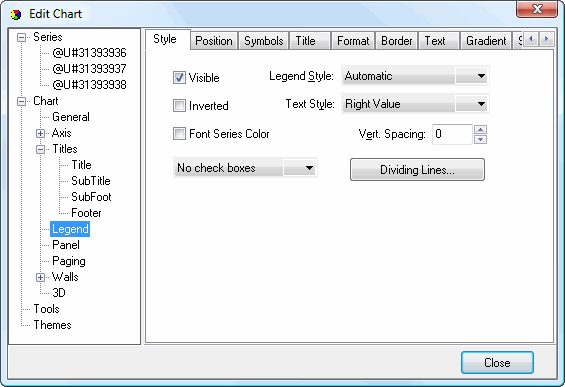
The Style subpage has the following options:
Visible: turn this setting on to display the legend.
Inverted: turn this setting on to display values in the legend from largest to smallest rather than the usual smallest to largest.
Font Series Color: turn this setting on to display the text for each item in the legend using the color of its item in the chart. With this turned off, the color specified in the Text subpage (discussed later) is used.
Boxes: this setting, which isn't labeled, allows you to specify whether check boxes or radio buttons appear for legend items. With check boxes turned on, you can hide specific series by turning off their check boxes. With radio buttons, only one series at a time is displayed, the one with the selected radio button.
Legend Style: the style for the legend. "Automatic" means the legend is automatically formatted as appropriate. "Series Names" displays the names of series; if a series field isn't used, only a single "Series0" appears. "Series Values" displays the values for the series if a series field is used or the category name for each item if not. "Last Values" displays only the last item in each series.
Text Style: use this option to specify how the legend is formatted. "Plain" means the legend includes category names (or series names if a series field is specified) only with no values. "Left Value" and "Right Value" mean the values for each category appear, either to the left or to the right of the category name. "Left Percent" and "Right Percent" mean each category's value appears as a percentage of the total, either to the left or to the right of the category name. "X Value" displays the category number for each item. "Value" shows only the value for each item. "Percent" shows only the value as a percentage of the total. "X and Value" displays the category number and its value. "X and Percent" shows the category number and value as a percentage of the total.
Vert. Spacing: this setting specifies the vertical spacing between items in the legend.
Dividing Lines: click this button to display the Border Editor dialog for lines between each item in the legend.
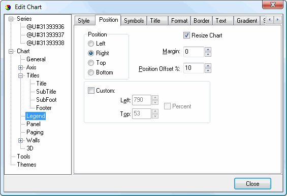
The Position subpage has the following options:
Position: this option specifies the location of the legend. The choices are Left, Right, Top, and Bottom.
Resize Chart: turn this setting on to resize the chart to account for the space taken up by the legend. If it's turned off, the chart fills the chart area.
Margin: use this setting to specify the amount of space between the chart and the legend. "0" means the space is automatically determined.
Position Offset %: this option determines the amount of space between the top or left edge of the chart (depending on the legend position) and the legend as a percentage of the chart size.
Custom: turn this setting on if you want to specify a custom position for the legend.
Left: this option, which is only available if Custom if turned on, specifies the left position of the legend.
Top: this option, which is only available if Custom if turned on, specifies the top position of the legend.
Percent: this option, which is only available if Custom if turned on, indicates whether the values for Left and Top are in pixels (turned off) or percent (turned on).
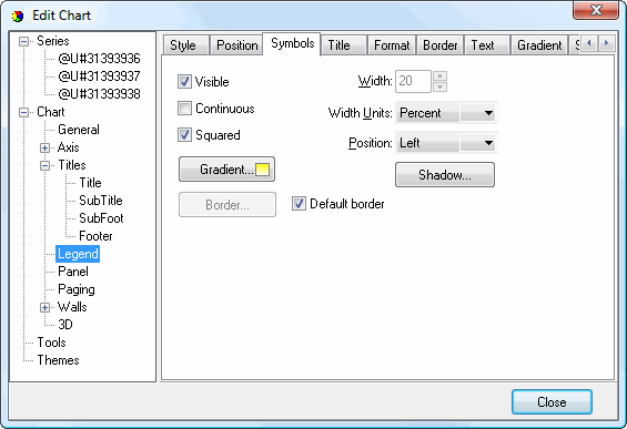
The Symbols subpage controls the appearance of the legend symbols, which represent the items in the chart. It has the following options:
Visible: turn this setting on to display symbols in the legend.
Continuous: turn this setting on to have the symbols run together, or turn it off to display symbols as individual shapes.
Squared: turn this setting on to display squares for symbols, or turn it off to use rectangles.
Width: this option, which is only available when Squared is turned off, specifies the width of the symbols.
Width Units: this setting determines whether Width is specified in pixels or percentage of the legend box width.
Position: select the desired location of the symbols, either to the right or left of the text.
Gradient: click this button to display the Gradient Editor dialog for the symbols.
Shadow: click this button to display the Shadow Editor dialog for the symbols.
Border: click this button, which is only available when Default border is turned off, to display the Border Editor dialog for lines between each item in the legend.
Default border: turn this setting on to use the default border for the legend.
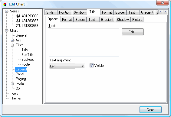
The Options subpage of the Title subpage has the following options:
Text: the text for the title.
Text alignment: this option specifies the alignment for the title text.
Visible: turn this setting on to display the title.
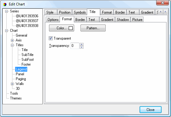
The Format subpage of the Title subpage has options which specify the shape in which the title appears. It has the following options:
Color: click this button to display a dialog in which you can select the inner color for the shape.
Pattern: click this button to display the Pattern Color Editor dialog.
Transparent: turn this setting on to display a transparent shape.
Transparency: use this setting to control the amount of transparency (in percent) of the shape.
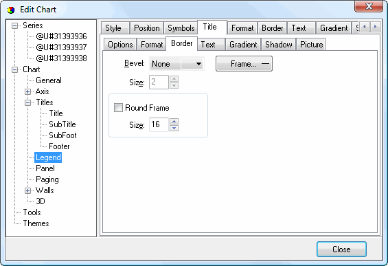
The Border subpage of the Title subpage has the following options:
Bevel: this setting specifies whether the shape appears with a lowered, raised, or no bevel.
Size: this setting, which is only available if Bevel is set to something other than None, specifies the size of the bevel.
Frame: click this button to display the Border Editor dialog for the shape.
Round Frame: turn this setting on to display the shape with a round frame. You can then specify the size of the roundness.
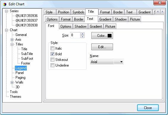
The Font subpage of the Text subpage of the Title subpage has the following options:
Size: select the size of the text.
Color: click this button to control the color of the text.
Style: select the desired style: italic, bold, strikeout, or underline.
Edit: click this button to display the Font dialog, which allows you to change several of the settings on this page at once.
Name: select the name of the font.
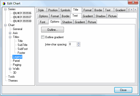
The Options subpage of the Text subpage of the Title subpage has the following settings:
Outline: click this button to display the Border Editor dialog for the outline of the text.
Outline gradient: click this button to display the Gradient Editor dialog for the text outline.
Inter-char spacing: increase the value of this setting to space the characters further apart.
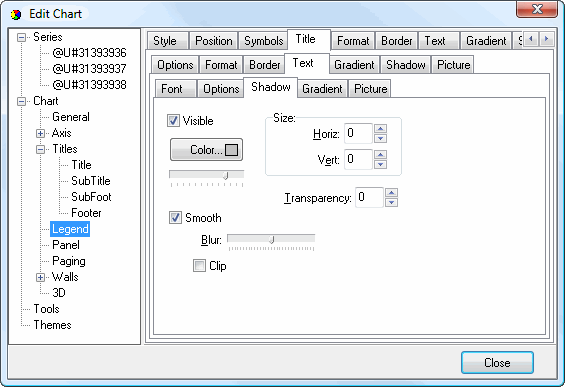
The Shadow subpage of the Text subpage of the Title subpage has the same options as the Shadow Editor dialog.
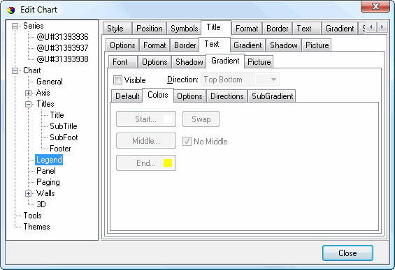
The Gradient subpage of the Text subpage of the Title subpage has the same options as the Gradient Editor dialog.
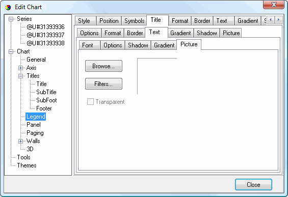
The Picture subpage of the Text subpage of the Title subpage has the following options:
Browse: click this button to display a dialog from which you can select the image file to use for the picture.
Filters: brings up the Filters Editor so you can apply various graphic effects to the image.
Transparent: turn this setting on to display a transparent picture.
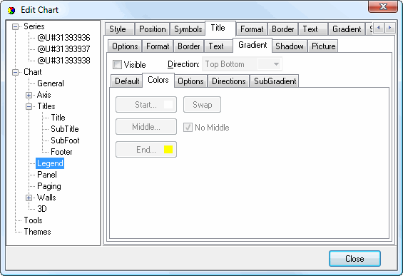
The Gradient subpage of the Title subpage controls the gradient settings for the shape in which the title appears. It has the same settings as the Gradient Editor dialog.
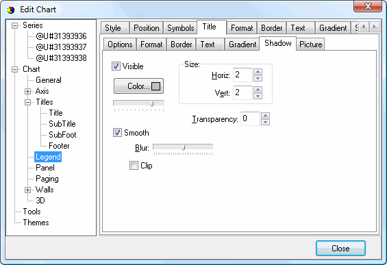
The Shadow subpage of the Title subpage controls the shadow for the shape in which the title appears. It has the same settings as the Shadow Editor dialog.
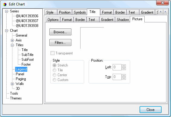
The Picture subpage of the Title subpage controls the picture for the legend title. It has the following options:
Browse: click this button to display a dialog from which you can select the image file to use for the picture.
Filters: brings up the Filters Editor so you can apply various graphic effects to the image.
Transparent: turn this setting on to display a transparent picture.
Style: this controls how the picture is formatted if the image is a different size than the symbol. The choices are:
Stretch: the image is stretched to fit the symbol.
Tile: the image is tiled to fit the symbol.
Center: the image is centered on the symbol.
Custom: turn this option on to specify where the image should be positioned using the Left and Top controls.
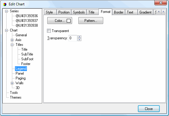
The Format subpage has the options which specify the shape in which the legend appears. It has the following options:
Color: click this button to display a dialog in which you can select the inner color for the shape.
Pattern: click this button to display the Pattern Color Editor dialog.
Transparent: turn this setting on to display a transparent shape.
Transparency: use this setting to control the amount of transparency (in percent) of the shape.
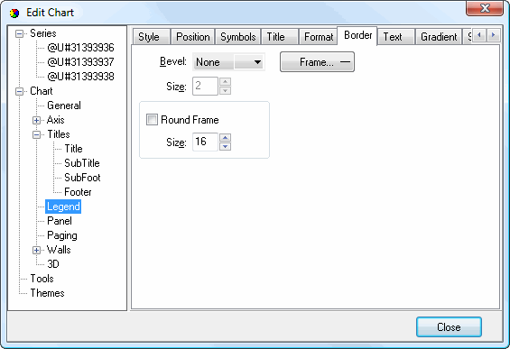
The Border subpage has the options which specify the legend border. It has the following options:
Bevel: this setting specifies whether the border appears with a lowered, raised, or no bevel.
Size: this setting, which is only available if Bevel is set to something other than None, specifies the size of the bevel.
Frame: click this button to display the Border Editor dialog for the border.
Round Frame: turn this setting on to display the shape with a round frame.
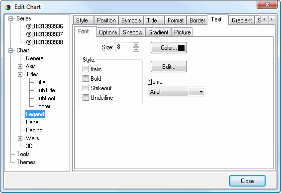
The Font subpage of the Text subpage has the following options:
Size: select the size of the text.
Color: click this button to control the color of the text.
Style: select the desired style: italic, bold, strikeout, or underline.
Edit: click this button to display the Font dialog, which allows you to change several of the settings on this page at once.
Name: select the name of the font.
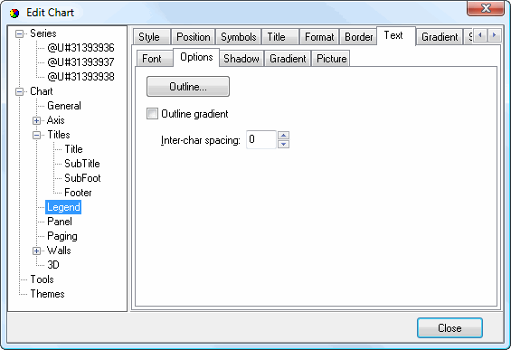
The Options subpage of the Text subpage has the following settings:
Outline: click this button to display the Border Editor dialog for the outline of the text.
Outline gradient: click this button to display the Gradient Editor dialog for the text outline.
Inter-char spacing: increase the value of this setting to space the characters further apart.
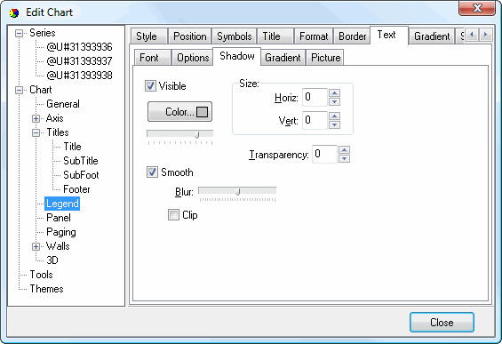
The Shadow subpage of the Text subpage has the same options as the Shadow Editor dialog.
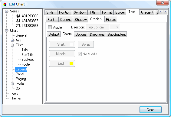
The Gradient subpage of the Text subpage has the same options as the Gradient Editor dialog.
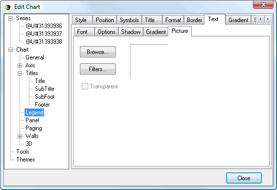
The Picture subpage of the Text subpage has the following options:
Browse: click this button to display a dialog from which you can select the image file to use for the picture.
Filters: brings up the Filters Editor so you can apply various graphic effects to the image.
Transparent: turn this setting on to display a transparent picture.
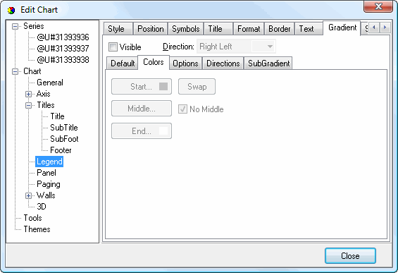
The Gradient subpage controls the gradient settings for the legend shape. It has the same settings as the Gradient Editor dialog.
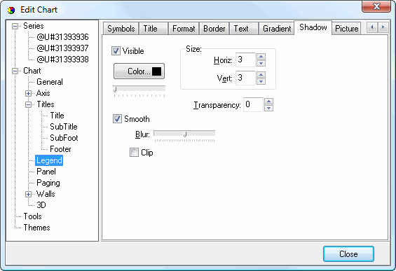
The Shadow subpage controls the shadow for the legend shape. It has the same settings as the Shadow Editor dialog.
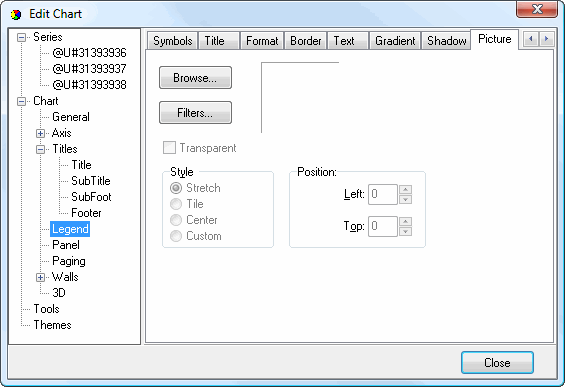
The Picture subpage controls the picture for the legend. It has the following options:
Browse: click this button to display a dialog from which you can select the image file to use for the picture.
Filters: brings up the Filters Editor so you can apply various graphic effects to the image.
Transparent: turn this setting on to display a transparent picture.
Style: this controls how the picture is formatted if the image is a different size than the symbol. The choices are:
Stretch: the image is stretched to fit the symbol.
Tile: the image is tiled to fit the symbol.
Center: the image is centered on the symbol.
Custom: turn this option on to specify where the image should be positioned using the Left and Top controls.
© Stonefield Software Inc., 2025 • Updated: 06/07/16
Comment or report problem with topic