 Paging Page
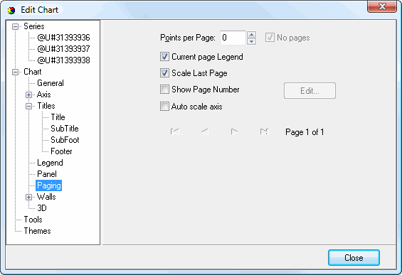
The Paging page allows you to split a chart with many items, which makes the chart difficult to read, into multiple pages. The arrows at the bottom of this page allow you to select which page to display in the chart. This page has the following options:
Points per Page: this setting specifies how many series (if a series field is used) or data points (if no series field is used) appear per page.
Current page Legend: turn this setting on to have the legend only show those items in the current page.
Scale Last Page: turn this setting on to have the last page scaled to fit the chart area.
Show Page Number: turn this setting on to display page numbers in the chart (for example, "Page 1 of 5"). This enables the Edit button
Auto scale axis: turn this setting on to automatically scale the axis.
Clicking the Edit button displays the Paging Editor.
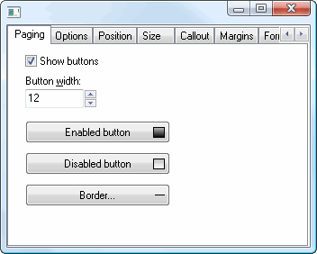
The Paging page has the following options:
Show buttons: turn this setting on to display paging buttons on the chart.
Button width: this controls the size of the buttons.
Enabled button: click this button to set the color of paging buttons when they're enabled.
Disabled button: click this button to set the color of paging buttons when they're disabled.
Border: click this button to display the Border Editor so you can control the button borders.
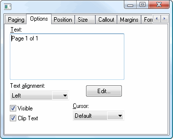
The Options page has the following options:
Text: the text to display on the chart indicating the current page.
Text alignment: this option specifies the alignment for the text.
Edit: click this button to display a Text Editor dialog.
Visible: turn this setting on to display the text.
Clip Text: turn this setting on to clip the paging text if it's outside the bounds of the chart.
Cursor: this setting specifies the shape of the mouse pointer when it's over the paging controls.
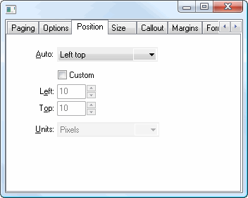
The Position page has the following options:
Auto: specifies where the paging controls appear. The choices are Left top, Left bottom, Right top, Right bottom, and Center.
Custom: turn this setting on to specify a custom position using the Left and Top settings.
Units: this affects the position value. "Percent" means the position value is a percentage of the total chart size while "Pixels" means the value is in pixels.
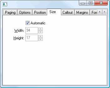
The Size page has the following options:
Automatic: turn this setting on to automatically determine the size of the paging controls.
Height: this setting, which is only available when Automatic is turned off, specifies the height of the controls.
Width: this setting, which is only available when Automatic is turned off, specifies the width of the controls.
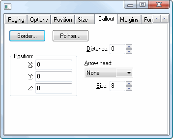
The Callout page has the following options:
Border: click this button to display the Border Editor dialog.
Pointer: click this button to display the Pointer Editor dialog.
Distance: this setting specifies the distance in pixels between the end of the line and the controls.
X: the X position of the line.
Y: the Y position of the line.
Z: the Z position of the line.
Arrow head: select the desired arrow head style from this drop-down list.
Size: this setting specifies the size of the line.
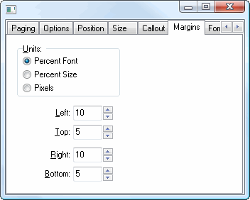
The Margins page has the following options:
Units: determines what units the numeric settings in this page have. The choices are:
Percent Font: the values are a percentage of the font size.
Percent Size: the values are a percentage of the symbol size.
Pixels: the values are in pixels.
Left: the left margin.
Top: the top margin.
Right: the right margin.
Bottom: the bottom margin.
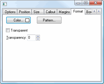
The Format page affects the frame. It has the following settings:
Color: click this button to display a dialog in which you can select the color.
Pattern: click this button to display the Pattern Color Editor dialog.
Transparent: turn this setting on to display a transparent frame.
Transparency: use this setting to control the amount of transparency (in percent) of the frame.
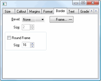
The Border page controls the border for the paging controls. This page has the following options:
Bevel: this setting specifies whether symbols appear with a lowered, raised, or no bevel.
Size: this setting, which is only available if Bevel is set to something other than None, specifies the size of the bevel.
Frame: click this button to display the Border Editor dialog.
Round Frame: turn this setting on to display the symbol with a round frame. You can then specify the size of the roundness.
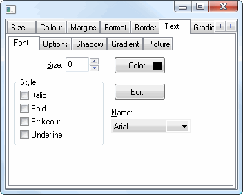
The Font subpage of the Text page affects the text in paging controls. It has the following settings:
Size: select the size of the text.
Color: click this button to control the color of the text.
Style: select the desired style: italic, bold, strikeout, or underline.
Edit: click this button to display the Font dialog, which allows you to change several of the settings on this page at once.
Name: select the name of the font.
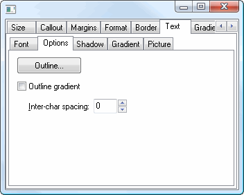
The Options subpage of the Text page has the following settings:
Outline: click this button to display the Border Editor dialog for the outline of the text.
Outline gradient: click this button to display the Gradient Editor dialog for the text outline.
Inter-char spacing: increase the value of this setting to space the characters further apart.
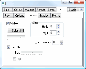
The Shadow subpage of the Text page has the same options as the Shadow Editor dialog.
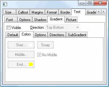
The Gradient subpage of the Text page has the same options as the Gradient Editor dialog.
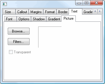
The Picture subpage of the Text page has the following options:
Browse: click this button to display a dialog from which you can select the image file to use for the picture.
Filters: brings up the Filters Editor so you can apply various graphic effects to the image.
Transparent: turn this setting on to display a transparent picture.
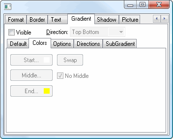
The Gradient page has the same settings as the Gradient Editor dialog.
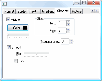
The Shadow page has the same settings as the Shadow Editor dialog.
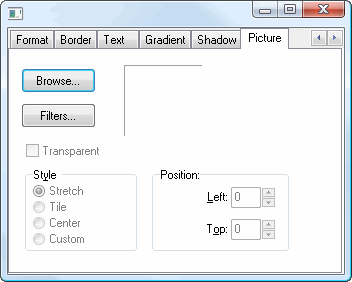
The Picture page has the following options:
Browse: click this button to display a dialog from which you can select the image file to use for the picture.
Filters: brings up the Filters Editor so you can apply various graphic effects to the image.
Transparent: turn this setting on to display a transparent picture.
Style: this controls how the picture is formatted if the image is a different size than the symbol. The choices are:
Stretch: the image is stretched to fit the symbol.
Tile: the image is tiled to fit the symbol.
Center: the image is centered on the symbol.
Custom: turn this option on to specify where the image should be positioned using the Left and Top controls.
© Stonefield Software Inc., 2025 • Updated: 06/07/16
Comment or report problem with topic