 Step 4: Formatting Options (Chart Report)
Step 4 allows you to specify how the chart appears. There are many options in this step but they are organized into groups. A chart editor dialog is also available to provide complete control over the chart's appearance.
The Series option at the top of Step 4 selects which series the settings apply to; this option is disabled if you did not select a series field in Step 3. This option allows you to format each series chart individually. For example, you could chart the first series as a bar chart, the second as a line chart, and the third as an area chart. If the All series option is turned on, changes in Step 4 affect all series of the chart.
As you make changes to the various options in this step, the chart displayed in this step automatically adjusts to show you what the chart looks like using your settings. However, it does not show actual data from your database until you click the Preview button.
The first option on the Chart Type page is Chart type. Select the type of chart you want from the drop-down list. The choices are Area, Bar, Column (the default chart type), Donut, Line, Pie, and Point. How do you decide what type of chart to create? It depends on the type of data you have and how you want to present it. "A Guide To Getting Data Visualization Right" discusses how to choose the type of chart to choose based on what you want to show. "Understanding Stacked Bar Charts: The Worst Or The Best?" discusses the use of stacked bar charts.
Some options only apply to certain chart types. The following are available for area charts:
Point type: this option specifies the shape of each point in the chart. The choices are None, Rectangles, Circles, and Triangles.
Series stacking: this option, which is only available if the chart has more than one series or more than one values field, allows you to stack series on top of each other rather than having them appear front to back. None means no stacking, Stacked means the series are stacked on top of each other, and Stacked 100% means the series are stacked so the each point is shown relative to the sum of that point in all series.
Stack group: this option, which is only available if the chart has more than one series, allows you to group series together. All the series with the same stack group value are treated the way the Series stacking option specifies. For example, if series 1, 2, and 3 all have Stack group set to 1 and series 4 and 5 have it set to 2, the first three series are stacked together and behind them, the last two series are stacked together. This option is disabled if All series is selected, as it applies to a specific series. Select a series from the Series option, then set Stack group as desired.
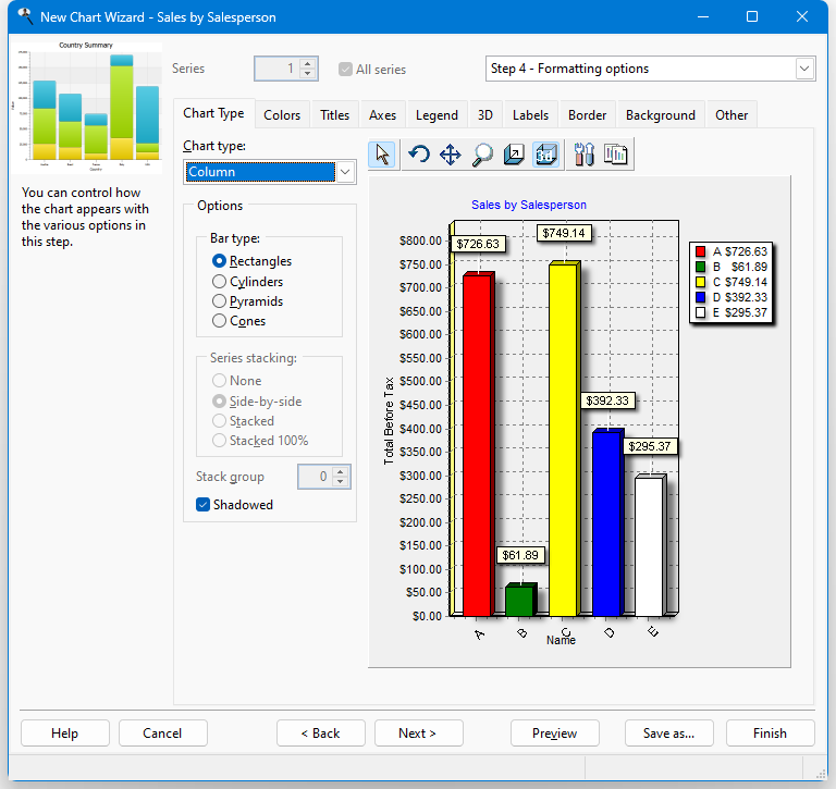
The following options are available for bar and column charts:
Bar type: this option allows you to specify what shape to use for bars or columns. The choices are Rectangles, Cylinders, Pyramids, or Cones.
Series stacking: this option, which is only available if the chart has more than one series, allows you to stack series on top of each other rather than having them appear front to back. None means no stacking, Side-by-side means the series are stacked beside each other, Stacked means the series are stacked on top of each other, and Stacked 100% means the series are stacked so the each point is shown relative to the sum of that point in all series.
Stack group: this option, which is only available if the chart has more than one series, allows you to group series together. All the series with the same stack group value are treated the way the Series stacking option specifies. For example, if series 1, 2, and 3 all have Stack group set to 1 and series 4 and 5 have it set to 2, the first three series are stacked together and behind them, the last two series are stacked together. This option is disabled if All series is selected, as it applies to a specific series. Select a series from the Series option, then set Stack group as desired.
Shadowed: turn this setting on to display a shadow for the bars or columns.
The following options are available for pie and donut charts:
Circled: if this option is turned on, the chart appears as a circle; turn it off to display an oval instead.
Group slices: this option allows you to group slices together. For example, suppose you have three large slices and ten small ones. You might want the small ones grouped together into one slice called, for example, "Other" or "Miscellaneous." Group slices has three settings: None (no grouping), Below Percent (all slices below a certain percentage of the total are grouped together), and Below Value (all slices below a certain value are grouped together).
Value: the value used when Group slices is set to Below Percent or Below Value.
Label: the label for the slice that combines smaller slices. The default is "Other."
Shadowed: turn this setting on to display a shadow for the slices.
The only option for line and point charts is Point type, which specifies the shape of each point in the chart. The choices are None, Rectangles, Circles, and Triangles.
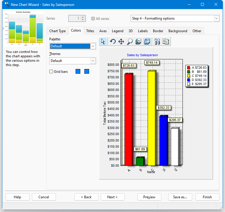
The Colors page has the following options:
Palette: this option allows you to select one of several palettes of colors for your chart.
Theme: selecting a theme controls many aspects of the chart, including the colors of data items, background, and legend, the size and style of the border, and so on.
If you choose a theme other than "Default," you cannot change:
- the chart title font on the Titles page (although you can change the font name, size, and style for the Category and Values axes, the font name is disregarded and the theme's font is used instead)
- gridline or tick count settings on the Axes page
- font and gradient settings on the Legend page
- Wall width on the 3D page
- font settings on the Labels page
- any settings on the Border or Background pages
- Grid bars: turn this option on to display alternating horizontal bands in the chart. Click the first colored button to specify the color of the first band and the second button for the color of the second.
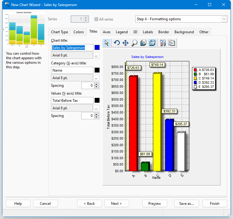
The Titles page has the following options:
Chart title: specifies the text, color, and font for the title of the chart. The default title is the name of the report. To change it, type a new title in the text box. To change the color of the text, click the colored square beside the title and select the desired color from the dialog that appears. To change the font or size, click the button with the ellipsis (...) and select the desired font and size from the dialog that appears. Note that if you select a font script other than Western, the script name (such as "Greek") appears after the font name, size, and style.
If you want to use an expression rather than fixed text, such as a user-defined function, add "{" and "}" (without the quotes) around field or function names in the text. (Previous versions allowed you to enter an equals sign followed by an expression; this is still supported but braces are easier to use.) Here's an example of an expression that displays "Sales for <spelled out month> <year>" (such as "Sales for December 2001") in the chart title:
Sales for {cmonth(date())} {year(date())}Here's an expression that uses the built-in GetConditionValue function, which returns the value of a filter condition for the specified field, to display a header showing "Sales for " a particular country the report is filtered on:
Sales for {GetConditionValue('customers.country')}Expressions can even include fields from the result set for the report.
If you want to include the chart total in the expression, use the built-in variable ChartTotal. Here's an example that formats the total as a currency to two decimals places (see the Function Reference topic for details on the Format function):
{Format('My Chart: Chart total = <0:c2>', ChartTotal)}If you want to include the filter conditions in the chart title when it's displayed in a dashboard, use:
{loReport.GetReportFilter()}To put each condition on a separate line, use:
{loReport.GetReportFilter(.T.)}Category (X-axis) title: specifies the text, color, and font for the title of the category, or X, axis; this option is unavailable for pie and donut charts since they don't have an X axis. The default title is the name of the category field. To change it, type a new title in the text box. To change the color of the text, click the colored square beside the title and select the desired color from the dialog that appears. To change the font or size, click the button with the ellipsis (...) and select the desired font and size from the dialog that appears. Note that if you select a font script other than Western, the script name (such as "Greek") appears after the font name, size, and style. To set the spacing between the title and the X axis, enter the desired value for the spacing; 0 means automatically determine the spacing.
Values (Y-axis) title: specifies the text, color, and font for the title of the value, or Y, axis; this option is unavailable for pie and donut charts since they don't have a Y axis. The default title is the name of the values field. To change it, type a new title in the text box. To change the color of the text, click the colored square beside the title and select the desired color from the dialog that appears. To change the font or size, click the button with the ellipsis (...) and select the desired font and size from the dialog that appears. Note that if you select a font script other than Western, the script name (such as "Greek") appears after the font name, size, and style. To set the spacing between the title and the Y axis, enter the desired value for the spacing; 0 means automatically determine the spacing.
Right Y-axis title: specifies the text, color, and font for the title of the right Y axis; this option is only available if there is a field plotted on the right-axis. The default title is the name of the field. To change it, type a new title in the text box. To change the color of the text, click the colored square beside the title and select the desired color from the dialog that appears. To change the font or size, click the button with the ellipsis (...) and select the desired font and size from the dialog that appears. Note that if you select a font script other than Western, the script name (such as "Greek") appears after the font name, size, and style. To set the spacing between the title and the Y axis, enter the desired value for the spacing; 0 means automatically determine the spacing.
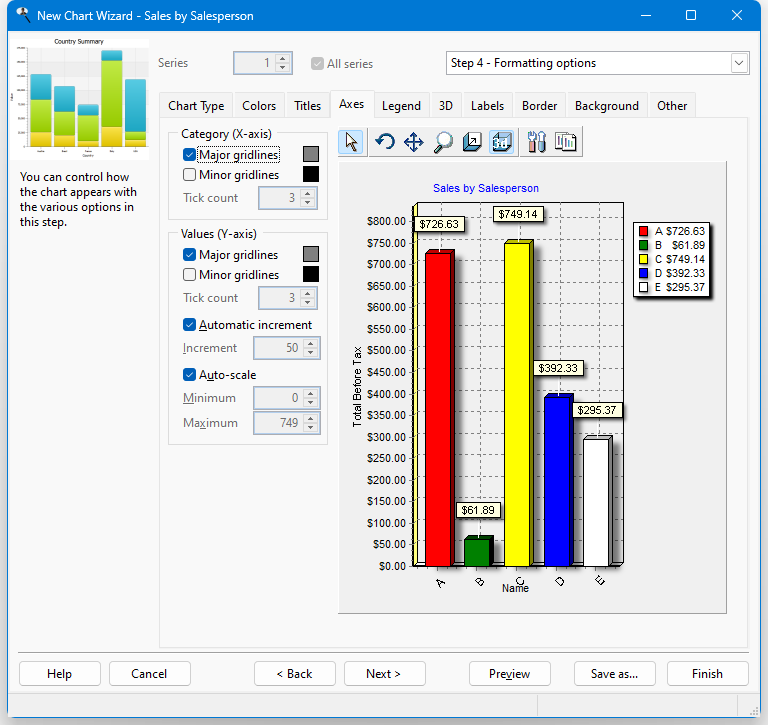
The Axes page has the following options:
Major gridlines: specifies whether major gridlines appear on the X or Y axes (depending on which option you set) and if so their color. The Automatic increment and Increment settings determine where major gridlines appear on the Y axis. For the X axis, they appear for every different category value. To change the color, click the colored square beside this setting and select the desired color from the dialog that appears.
Minor gridlines: specifies whether minor gridlines appear on the X or Y axes (depending on which option you set) and if so their color. Minor gridlines appear between major gridlines. The number of minor gridlines between major gridlines is determined by the Tick count setting. To change the color, click the colored square beside this setting and select the desired color from the dialog that appears.
Tick count: this option, which is only available if Minor gridlines is turned on, specifies how many minor gridlines appear between major gridlines on the appropriate axis.
Automatic increment: if this option is turned on, which it is by default, Stonefield Query automatically determines the placement of value labels (and major gridlines if that option is turned on) on the Y axis. This value is based on the maximum value for the chart and the height of the chart. If the chart has two value fields, there are separate settings for the left and right axis.
Increment: this option, which is only available if Automatic increment is turned off, specifies how frequent value labels appear on the Y axis. For example, a setting of 100 specifies that value labels appear at multiples of 100 (0, 100, 200, and so forth). The larger the number, the fewer the labels. If the chart has two value fields, there are separate settings for the left and right axis.
Auto-scale: this option determines whether the minimum and maximum values for the Y-axis are determined automatically based on the data (turned on) or set manually (turned off). If the chart has two value fields, there are separate settings for the left and right axis.
Minimum: this option, which is only available if Auto-scale is turned off, specifies the minimum value for the Y-axis. If the chart has two value fields, there are separate settings for the left and right axis.
Maximum: this option, which is only available if Auto-scale is turned off, specifies the maximum value for the Y-axis. If the chart has two value fields, there are separate settings for the left and right axis.
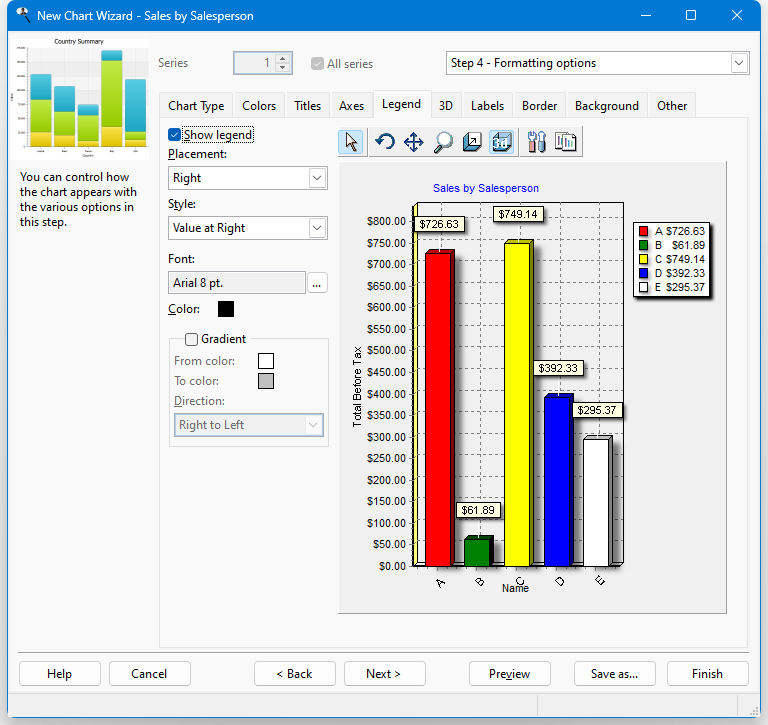
You can specify whether a legend appears on the chart using the settings on the Legend page. If a series field is used, the legend shows the different series values. If no series field is used, the legend shows the different category values. This page has the following options:
Show legend: turn this option on to display a legend on the chart.
Placement: this option specifies where the legend appears on the chart. The choices are Left, Right, Top, and Bottom.
Style: use this option to specify how the legend is formatted. The choices are different if you have a series field than if no series field is used. Plain means the legend includes category names (or series names if a series field is specified) only with no values. Values at Left and Values at Right, which are only available if no series is used, mean the values for each category appear, either to the left or to the right of the category name. Percent at Left and Percent at Right, which are only available if no series is used, mean each category's value appears as a percentage of the total, either to the left or to the right of the category name. Checkboxes, which is only available if a series is used, indicates the legend includes check boxes which you can use to display or hide certain series (turn off the check box to hide a series).
Font: the font name, size, and style to use for the text in the legend. To change any of these, click the font selection button (which appears as "...") and select the desired font name, size, and style from the Font dialog that appears. Note that if you select a font script other than Western, the script name (such as "Greek") appears after the font name, size, and style. This setting is disabled if you select a theme since theme settings override that.
Color: the color to use for the text in the legend. To change the color, click the colored square beside this setting and select the desired color from the dialog that appears.
Gradient: turn this setting on to display a gradient of color across the legend.
From color: this option, which is only available if Gradient is turned on, specifies the starting color for the gradient. To change the color, click the colored square beside this setting and select the desired color from the dialog that appears.
To color: this option, which is only available if Gradient is turned on, specifies the ending color for the gradient. To change the color, click the colored square beside this setting and select the desired color from the dialog that appears.
Direction: this option, which is only available if Gradient is turned on, specifies in which direction the gradient flows. The choices are Top to Bottom, Bottom to Top, Left to Right, Right to Left, From Center, From Top Left, From Bottom Left, Radial, Diagonal Up, and Diagonal Down.
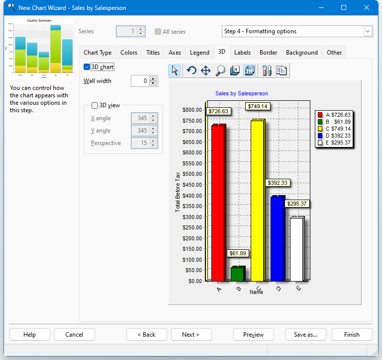
The 3D page has the following options:
3D chart: turn this setting on, which it is by default, to display the chart in 3 dimensions. You can also click the 3D button in the toolbar to turn on or off 3-dimensional viewing.
Wall width: this option determines the width of the walls at the X and Y axis.
3D view: turn this setting on to display the chart from a perspective.
X angle: this option, which is only available if 3D view is turned on, specifies the X angle for the view. You can also change this by clicking the rotate button (
 ) in the chart toolbar and clicking and dragging the chart to the desired angle.
Y angle: this option, which is only available if 3D view is turned on, specifies the Y angle for the view. You can also change this by clicking the rotate button (
) in the chart toolbar and clicking and dragging the chart to the desired angle.Perspective: this option, which is only available if 3D view is turned on, specifies the perspective angle for the view. You can also change this by clicking the rotate button (
) in the chart toolbar and clicking and dragging the chart to the desired angle.
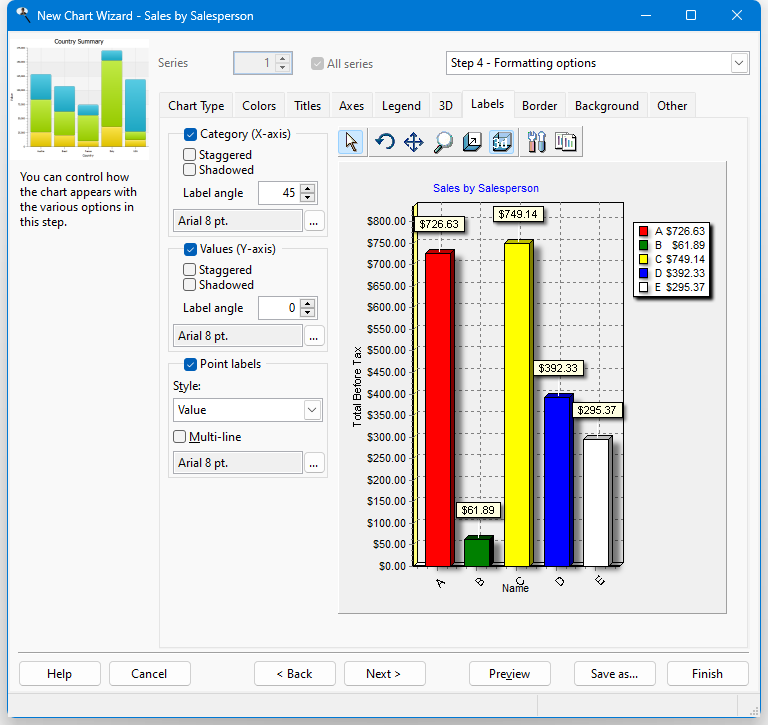
The Labels page has the following options:
Category (X-axis) and Values (Y-axis): turn these options on, which they are by default, to display labels for the values of the X and Y axis.
Staggered: if label names are fairly long, especially in the case of category names, they can overlap each other. Turn this setting on to stagger the labels to minimize the overlap.
Shadowed: turn this setting on to display labels with shadowed text.
Label angle: this option specifies the angle at which the text of the label is displayed. This can also help reduce label overlap. For the X axis, the angle can be 0, 45, 90, -45, and -90. For the Y axis, the choices are 0, 90, and -90.
Font: to change the font or size of the labels, click the button with the ellipsis (...) and select the desired font and size from the dialog that appears. Note that if you select a font script other than Western, the script name (such as "Greek") appears after the font name, size, and style.
Point labels: turn this option on, which it is by default, to display labels for each category in the chart. For all but pie and donut charts, point labels appear at the top of the point for a particular data item in the chart. For pie and donut charts, point labels appear beside each slice.
Point labels are automatically positioned on the chart. You can manually move a point label to a different position by dragging it to the desired position. Note that this is for preview purposes only; point label positions are restored to default when the chart is printed or output to file.
Style: this setting, which is only available if Point labels is turned on, specifies what is displayed for point labels. The choices are Value, Percent (which shows each value as a percentage of the total), Category (the default), Category & Percent, Category & Value, Percent & Total (which shows each value as a percentage and the total), Category, Percent & Total, and Percent Relative (which shows each value as a percentage of the smallest non-zero value).
Multi-line: turn this setting on to display long point labels on multiple lines rather than a single long line.
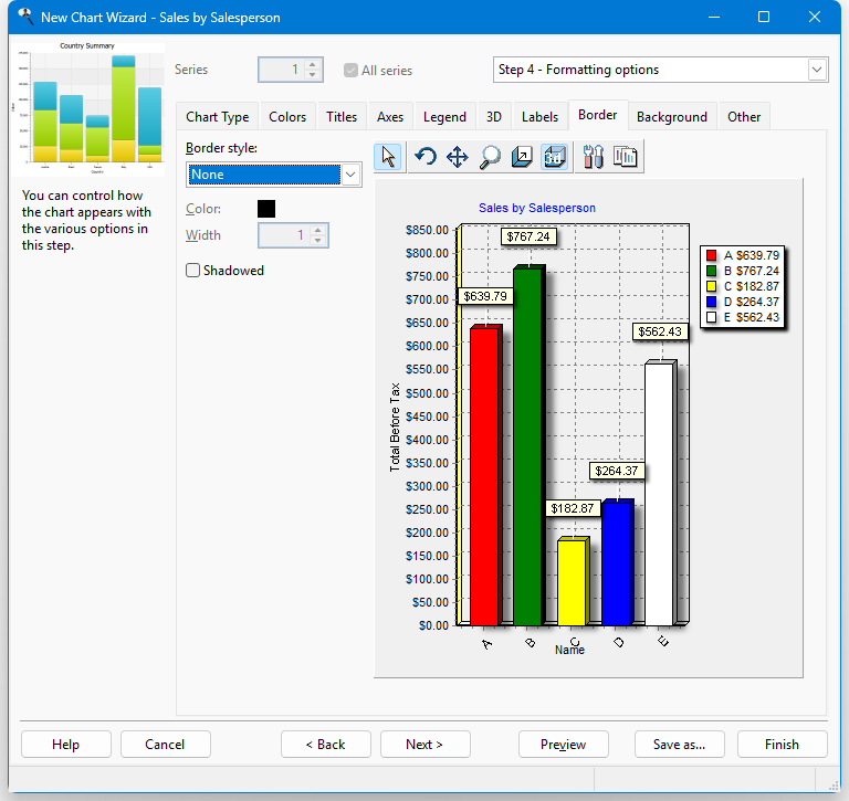
The Border page has the following options:
Border style: this setting specifies how the border of the chart appears. The choices are None (the default), Plain, Lowered, or Raised.
Color: this setting, which is only available when Border style is set to something other than None, specifies the color of the border. To change the color, click the colored square beside this setting and select the desired color from the dialog that appears.
Width: this setting, which is only available when Border style is set to something other than None, specifies the width of the border.
Shadowed: if this setting, which is only available when Border style is set to something other than None, is turned on, the border includes a shadow.
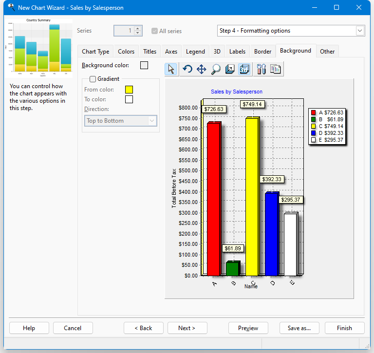
The Background page has the following options:
Background color: this setting, which is only available when Gradient is turned off, specifies the color of the chart background. To change the color, click the colored square beside this setting and select the desired color from the dialog that appears.
Gradient: turn this setting on to display a gradient of color across the chart background.
From color: this option, which is only available if Gradient is turned on, specifies the starting color for the gradient. To change the color, click the colored square beside this setting and select the desired color from the dialog that appears.
To color: this option, which is only available if Gradient is turned on, specifies the ending color for the gradient. To change the color, click the colored square beside this setting and select the desired color from the dialog that appears.
Direction: this option, which is only available if Gradient is turned on, specifies in which direction the gradient flows. The choices are Top to Bottom, Bottom to Top, Left to Right, Right to Left, From Center, From Top Left, From Bottom Left, Radial, Diagonal Up, and Diagonal Down.

The options on the Other page depend on whether you are working with a chart report or a chart included in a quick or cross-tab report. Both types have these options:
Width: specifies the width of the chart in pixels when it's output.
Height: specifies the height of the chart in pixels when it's output.
Points per page: set this to the number of data points you want on each page; 0 means put them all on the first page. If there are more than that many data points in the chart, a paging control appears when you preview the chart so you can move to the next or previous page.
If you are working with a chart report, other options are available:
Orientation: the default choice, "Automatic," means that if the chart is too wide to fit in portrait orientation, it automatically switches to landscape. However, you can override this by choosing either "Portrait" or "Landscape" to force the report to be printed in the desired orientation.
Paging: the paging settings allow you to create multi-page charts. If you don't turn on paging and your chart has more than 300 data points, you'll get a warning that the report can't run because there are too many data points. Turn on Paging to enable the other options.
Auto-scale: turning this on scales the horizontal axis automatically based on the number of data points displayed.
Scale last page: this determines how the last chart page is displayed. Turn this on to have the last page use the same horizontal scaling than the other pages. Turning it off adjusts the page scaling based on the number of points on that last page.
If the chart is included in a quick or cross-tab report, four other options appear:
Position on report: this setting allows you to specify whether the chart should appear at the top of the report (before the quick or cross-tab data) or at the bottom (after the data). This option is forced to Bottom and is disabled if the Display chart after each group setting is turned on.
Display chart on separate page: turn this setting on to display the chart on its own page, either before or after the rest of the report.
Display chart after each group: if this setting is turned off, the chart appears at the end of the report, showing the data for the entire report. If it's turned on, the chart appears after each group (page field in the case of a cross-tab report), showing the data for just that group.
Alignment: determines how the chart is aligned horizontally on the page: left, right, or center (the default).
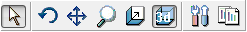
The chart toolbar provides additional control over the chart. It has the following functions:
Normal (
 ): returns the mouse pointer to a normal pointer.
Rotate (
): enables rotation mode. Click and drag the chart to the desired angle.Move (
 ): enables movement mode. Click and drag the chart to move it to the desired position.
Zoom (
 ): enables zoom mode. Click and drag the chart to zoom in and out.
Depth (
 ): enables depth mode. Click and drag the chart to scale it to the desired depth.
3D (
 ): turns on and off 3-dimensional viewing.
Edit (
 ): displays the Edit Chart dialog. This button is not displayed for a chart included in a quick or cross-tab report.
Copy (
 ): copies the chart to the clipboard.
© Stonefield Software Inc., 2025 • Updated: 11/24/23
Comment or report problem with topic